Overview
“The Love Fridge is a Chicago-based initiative created to nourish our communities through mutual aid… volunteers come from all over Chicago, working within their own neighborhoods to collaborate with like-minded partners to place community refrigerators across the city.” – https://www.thelovefridge.com/
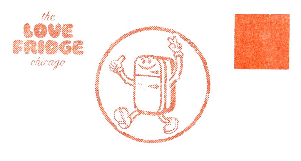
Getting to Know the Love Fridge

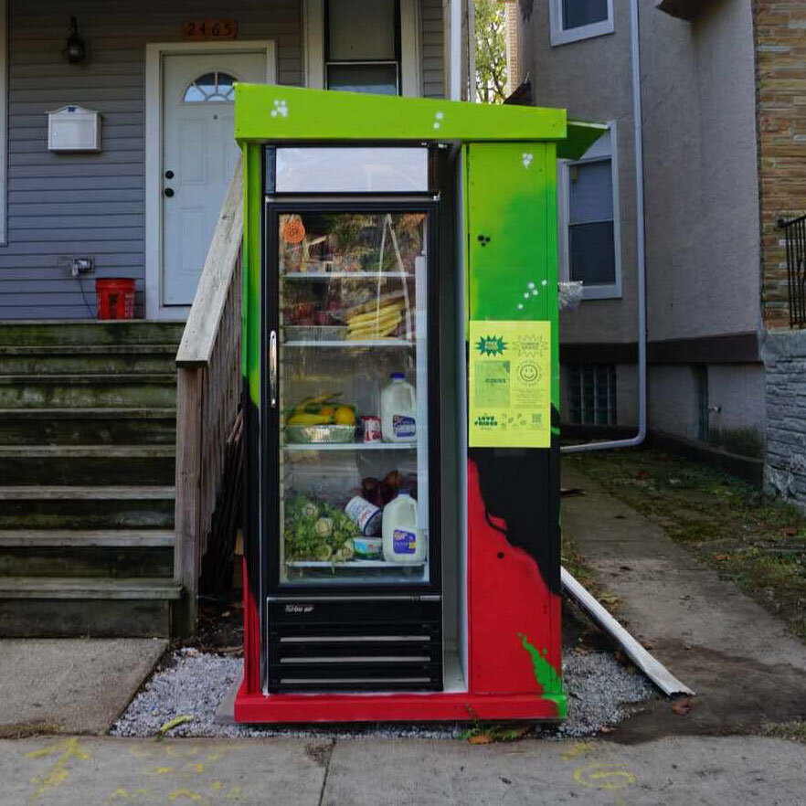


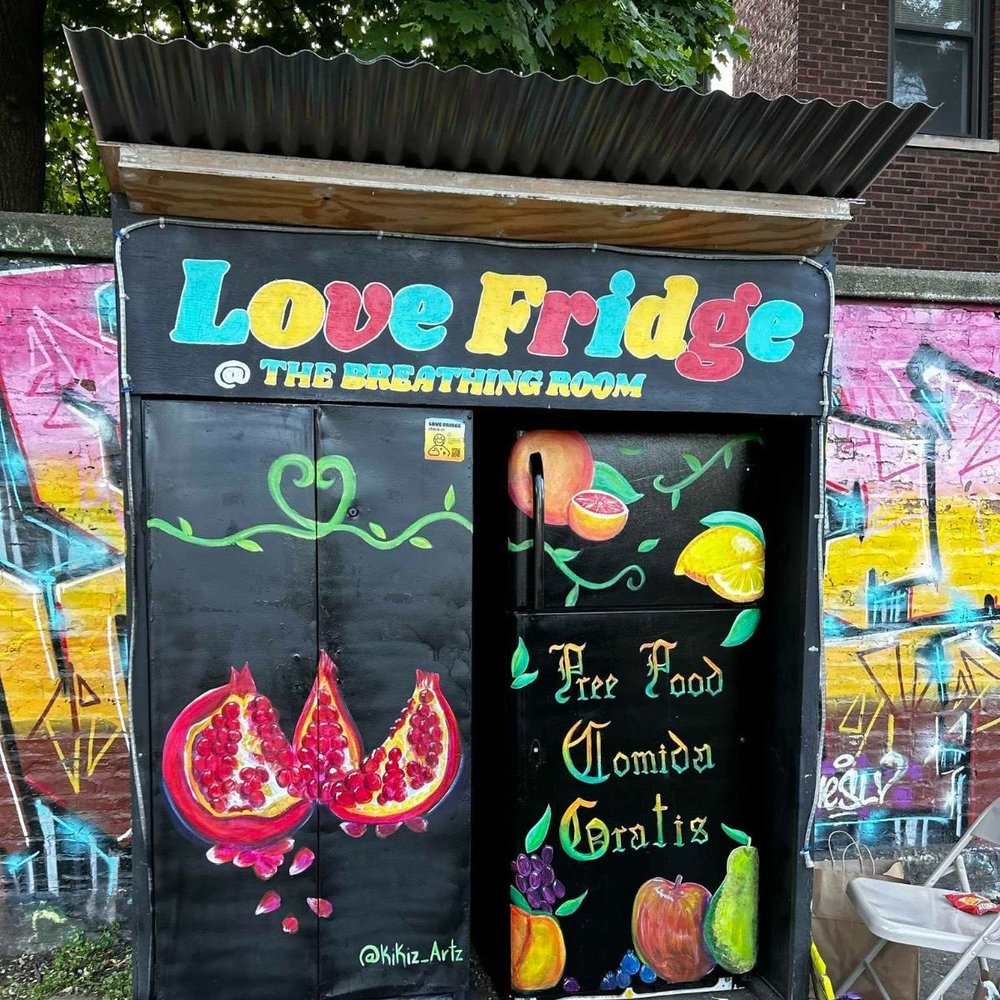
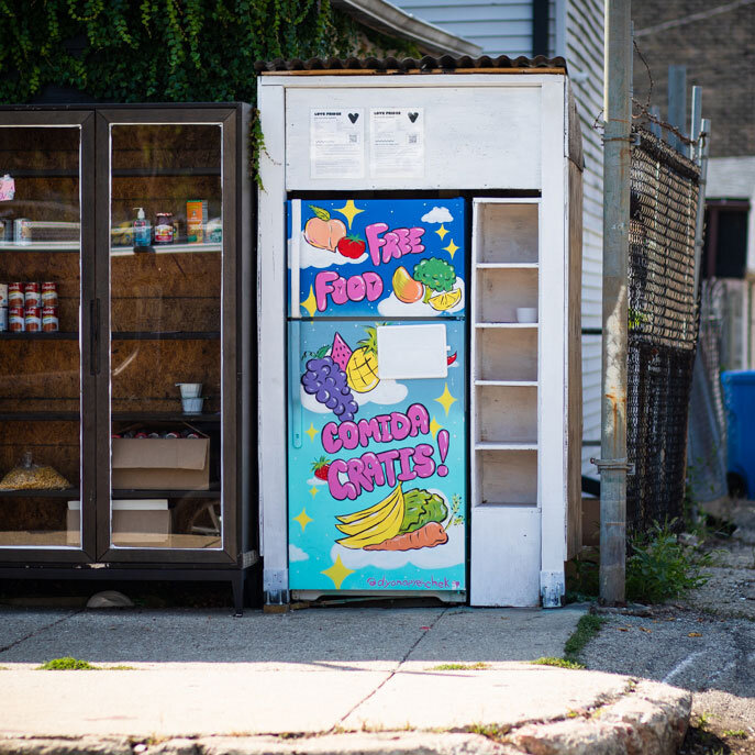
To be more informed about the Love Fridge, I visited several sites to take note on how they are used and what problems existed. While discussing with peers who lived around the sites, I realized that people were either not aware of the Love Fridges or were unsure of how to use/contribute to them.
Ideation
I had been interested in printing with the UIC Design Lab’s Risograph printer for a while, so I used this opportunity to learn more about the machine. After receiving training from my professor, I found that the Risograph uses oil based ink and is meant to produce a high volume of output in a cost and time efficient manner.
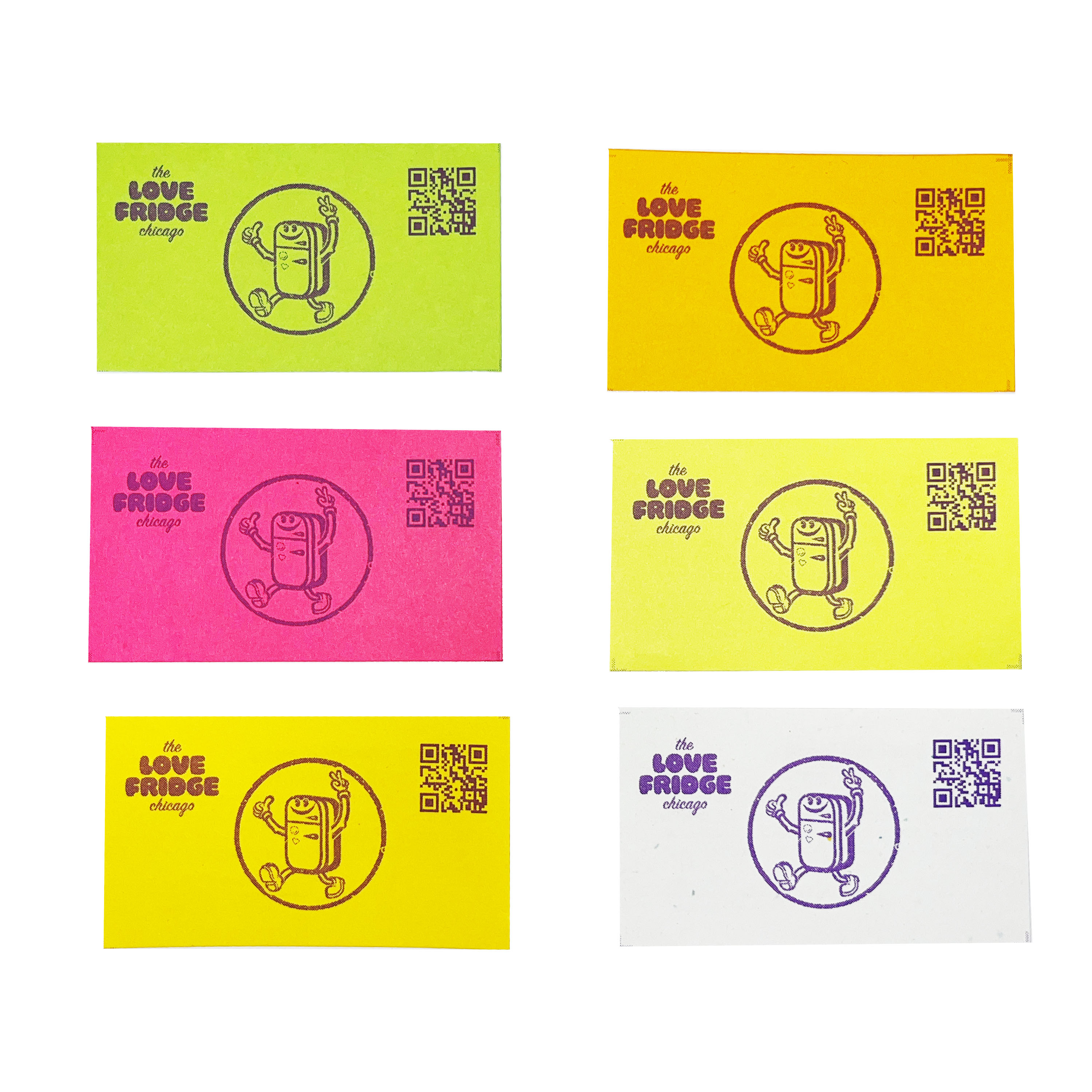
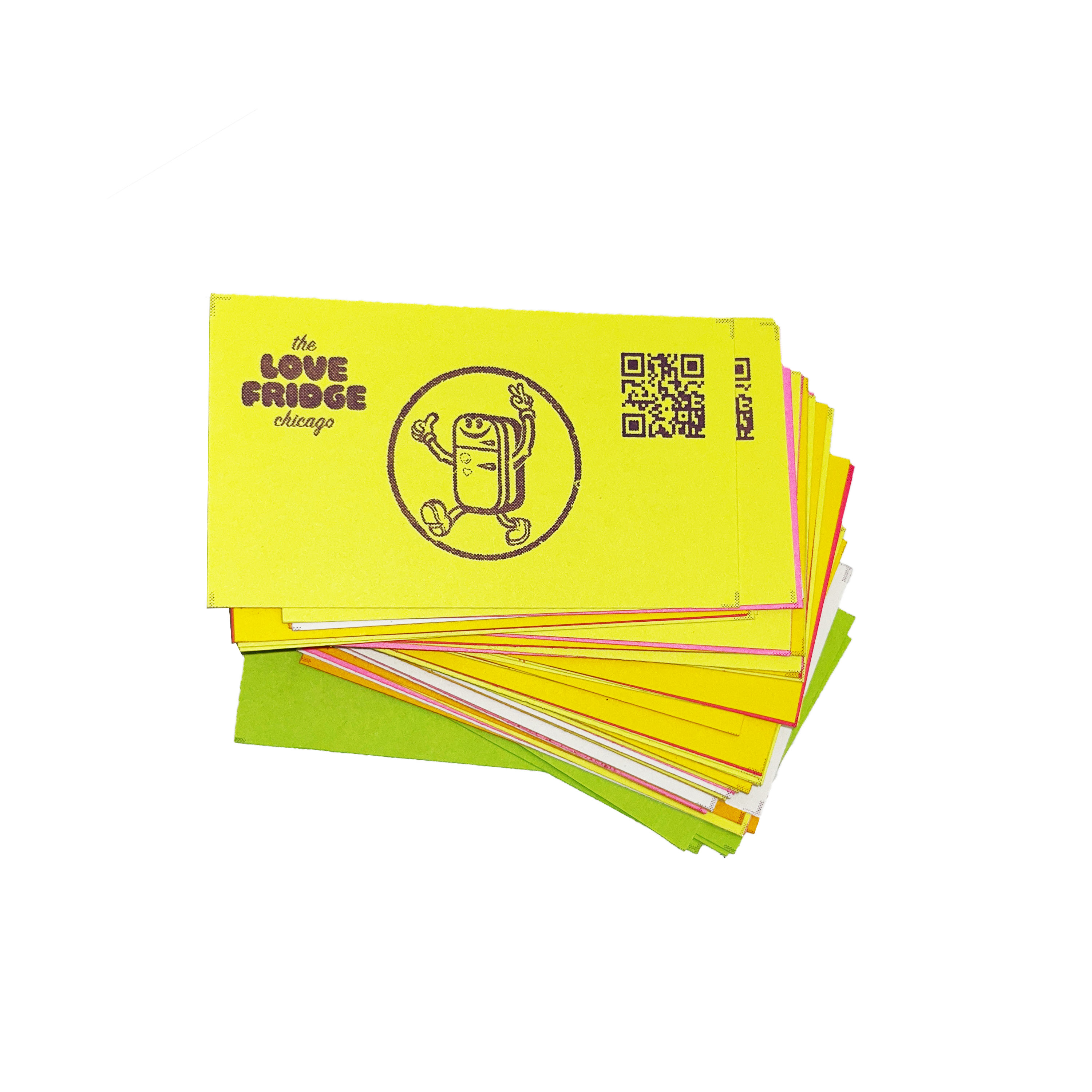
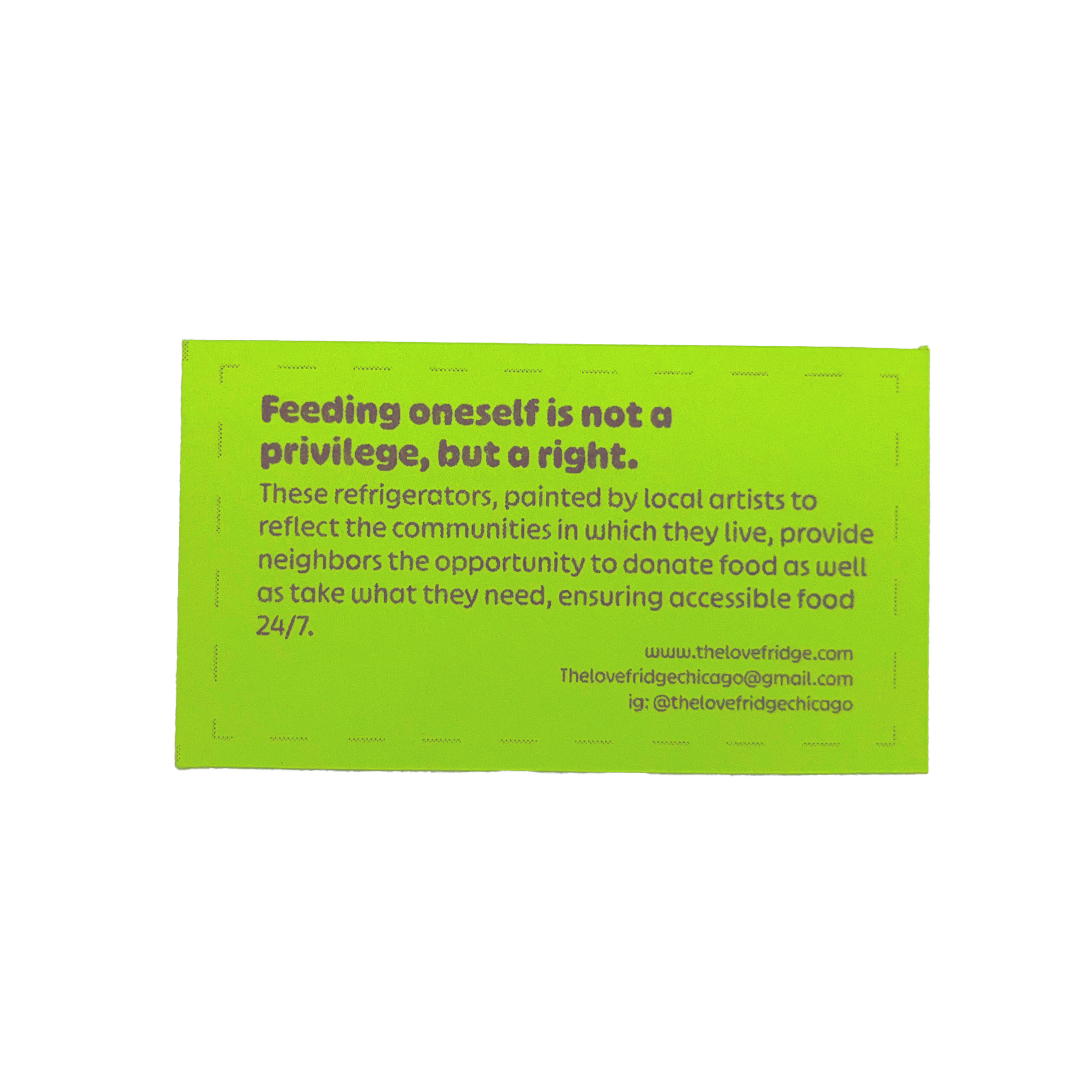
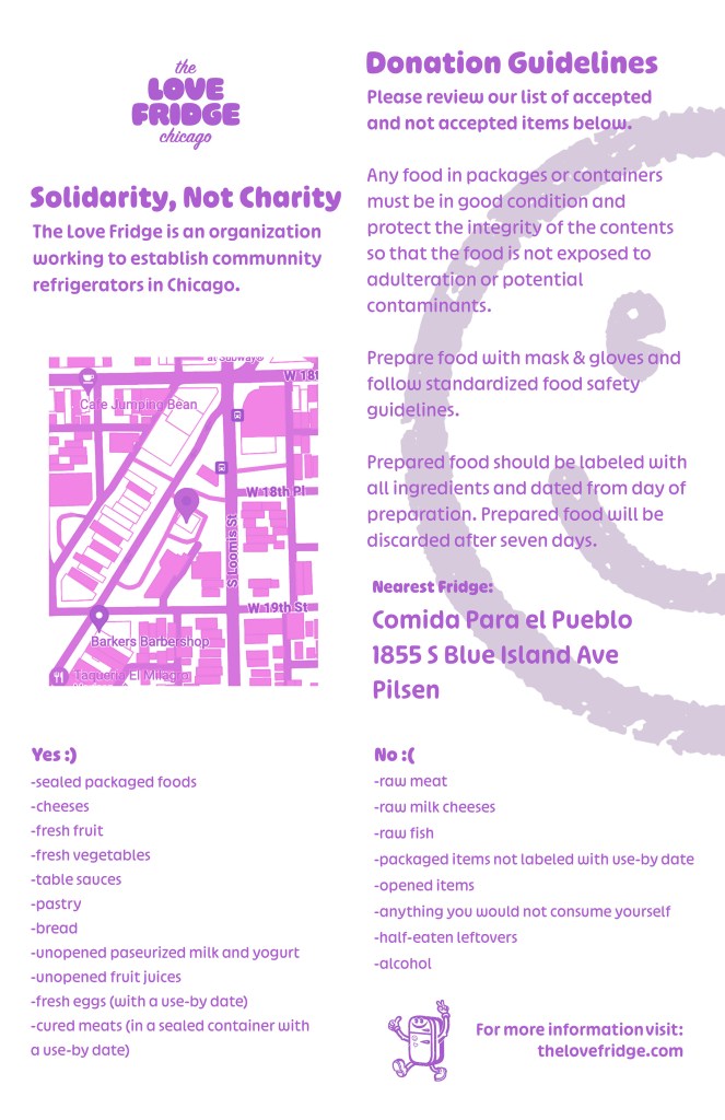
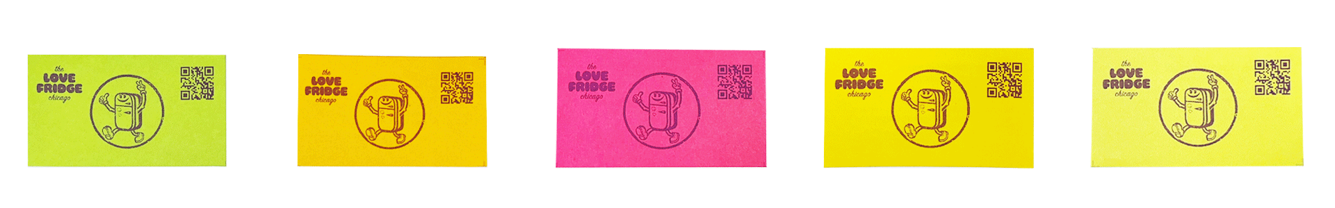
These factors made the Risograph ideal for my project. I could create large quantities of physical promotion for the Love Fridge. After consulting with the team at the Love Fridge, I learned that tabling events are a large part of their promotion and thought up the idea of a Community Card that informs the recipient of the Love Fridge’s goal and redirects them to more information on their website. I also decided to mass produce posters which could be spread around the Blue Island Love Fridge to show people it’s location and inform them about how it works. Using Risograph for this type of poster makes sure that the text doesn’t get distorted when it is rained on since the ink is oil based.

Originally, I planned to make AR business cards which could be scanned and viewed through a phone. Though this made the design more playful and interactive, I decided against this because it would add an additional step between the user and the information. So I settled on a simple but effective QR code to the site.
Final Designs
My final designs were simple yet effective in communicating the message of the Love Fridge all while adhering to their existing visual language. I’m glad I put in the extra effort to learn using the Risograph as it gave the cards a grainy, halftone texture and handmade feel. My work was received positively by the team at the Love Fridge and the next semester I was delighted to hear that my community cards were put to use and handed out during tabling events!